Back
Dr Care+
Designing a rebrandable health app that empowers hospitals and simplifies patient care through vitals tracking, calorie monitoring, and seamless doctor appointments.

Project context
DrCare is a health monitoring and doctor appointment app designed to be white-labeled by hospitals. The goal was not just to build a useful tool but to craft a personalized, intuitive, and scalable patient experience.
Hospitals today are looking for more than just digital systems — they want brand-connected experiences that build trust and loyalty. DrCare bridges that gap.
The problem
Patients need simple, stress-free tools to take control of their health , not complex systems. At the same time, hospitals want to offer digital experiences that reflect their brand and care philosophy.
1. First thought
Rethinking how patients book doctors.
One of the challenges I faced while designing the doctor appointment booking flow was something I didn’t see at first — but patients certainly felt it.
I had created a neat, logical flow:
Book Appointment → Choose Specialization → View Doctors → Select Slot → Confirm.

But something didn’t sit right.
Then I started thinking like a patient, not a designer. Let’s imagine it’s 11 PM. Your mother is in pain.You open the app to book a doctor. And the first thing it asks you is:
‘Choose a specialization.’
You freeze.
Patient don’t know whether to pick General Medicine or Neurology.
Is it a nerve problem? Is it something else?
You're already stressed — and now you’re stuck guessing.
That’s when it hit me:
Now, the solution is
Symptom-first interface
I created a symptom-first interface — allowing users to pick things like: Headache, Joint pain, Anxiety, Skin issues, Cold & cough.
Asking user "Tell us what’s bothering you?" is the flow starting point
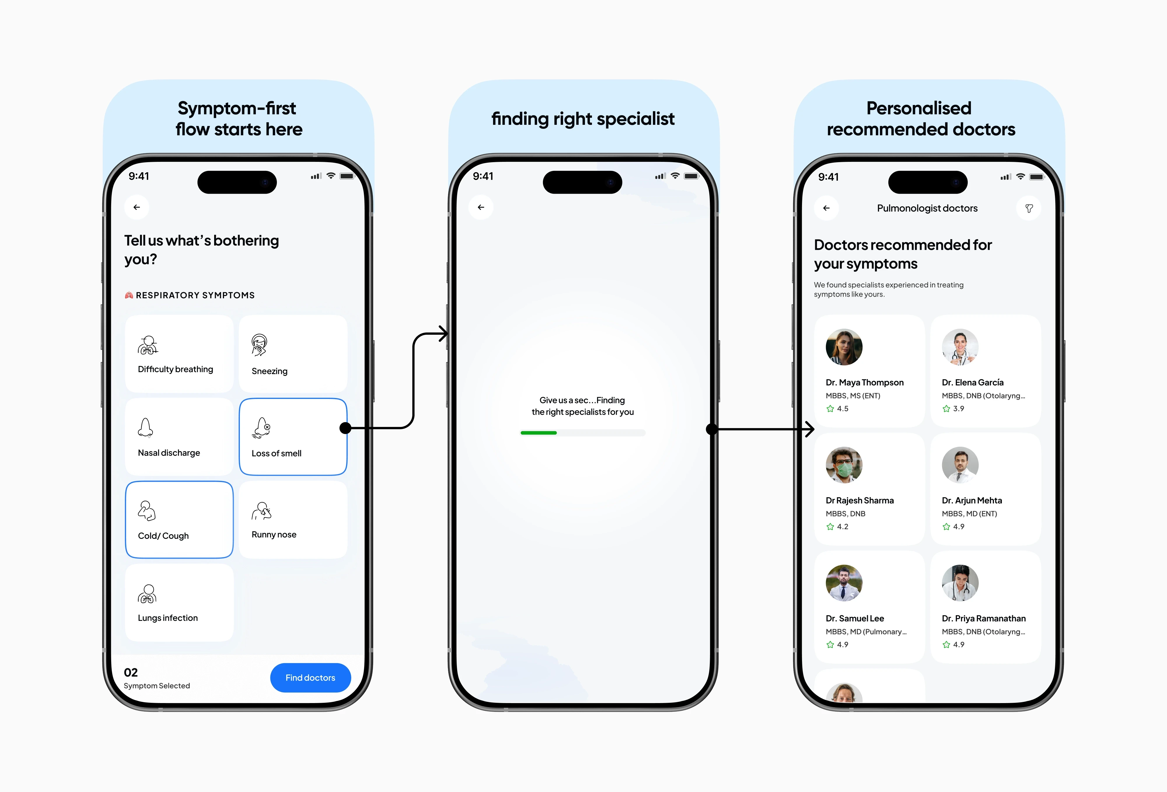
And based on their input, we show:
✅ Suggested specializations
✅ Available doctors
✅ Ratings, availability, consultation type
What experience it offers
❖ It reduced confusion.
❖ Increased trust.
❖ Helped users book appointments faster.
We learned that the best UX doesn’t just guide users — it reassures them.
In moments of uncertainty, people don’t need a perfect UI.
They need clarity, comfort, and confidence.
That’s what this design now delivers.”
Second thought
Fast access to care.
When every second matters because not every patient has the luxury of time.
The Problem
Patients in distress are often overwhelmed.
❖ Unclear symptom selection steps
❖ Decision fatigue when choosing doctors
❖ Uncertainty about wait time, or next steps
Why it's a problem
We observed 3 patterns:
❖ Drop-offs when users are unsure which doctor is right
❖ Delays when health devices flag issues but there's no guided next action
❖ Emotional hesitation — users feel scared, not supported
We needed to design a flow that feels urgent, intuitive, and human without adding cognitive load.
Now, the solution is
Quick Consult, Three Ways
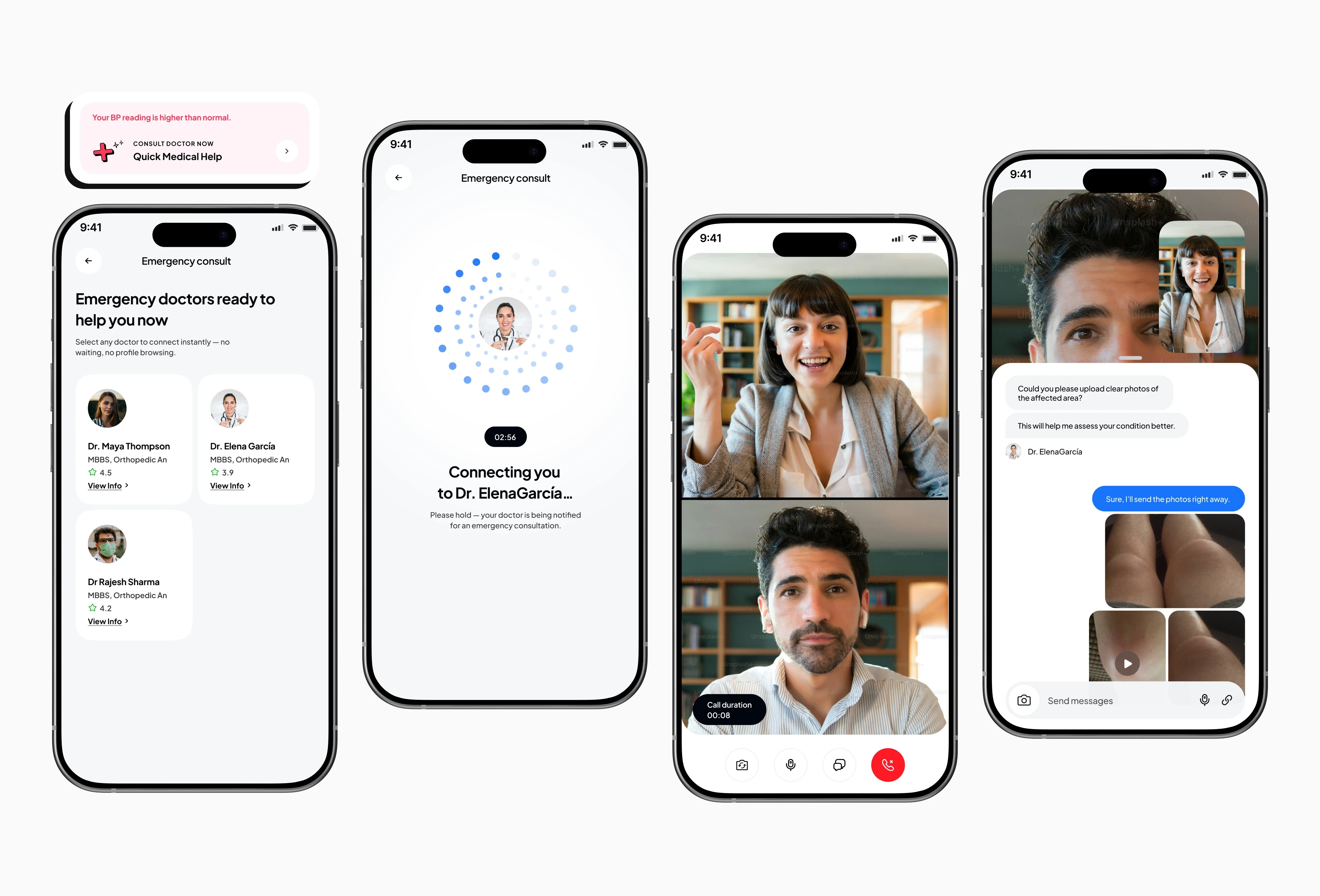
1. Auto alert flow (Device flags health concern)
When the device detects a critical issue (e.g., high BP or irregular heart rate)
❖ User is notified with a red alert card
❖ The app auto-suggests a specialist and offers direct consult
❖ Pre-filled details, one-tap connect, and seamless payment flow
❖ Doctor joins within seconds via video
🧠 This flow reduces decision steps by 70% and lowers anxiety by acting “for” the user.

2. Quick help flow (User reports symptoms)
If users feel unwell but it’s not urgent:
❖ They're gently prompted: “Tell us what’s going on”
❖ A friendly symptom list guides them
❖ Matches are based on context and availability
❖ A consult is ready in under 1 minute
This puts users in control while still making decisions easier and faster.

3. Quick question flow (Non-urgent)
For small but important concerns:
❖A quick entry point: “Can I ask something?”
❖ User chooses from common concerns like medication, side effects, or general advice
❖ The app connects to a doctor ready for quick video call
This makes it okay to “just ask” — reducing barriers to preventive care.
Outcome
❖ Emergency bookings: 2x faster, now under 60 sec
❖ More trust during emergencies through thoughtful UX
Third thought
Effortless health tracking.
When every second matters because not every patient has the luxury of time.
The Problem
Most health apps ask users to log data manually — heart rate, sleep, symptoms, activities. But here's the reality:
❖ Users forget.
❖ Motivation drops.
❖ Manual logging becomes a chore, not a habit.
Despite best intentions, users slowly stop tracking their health entirely.
Solution
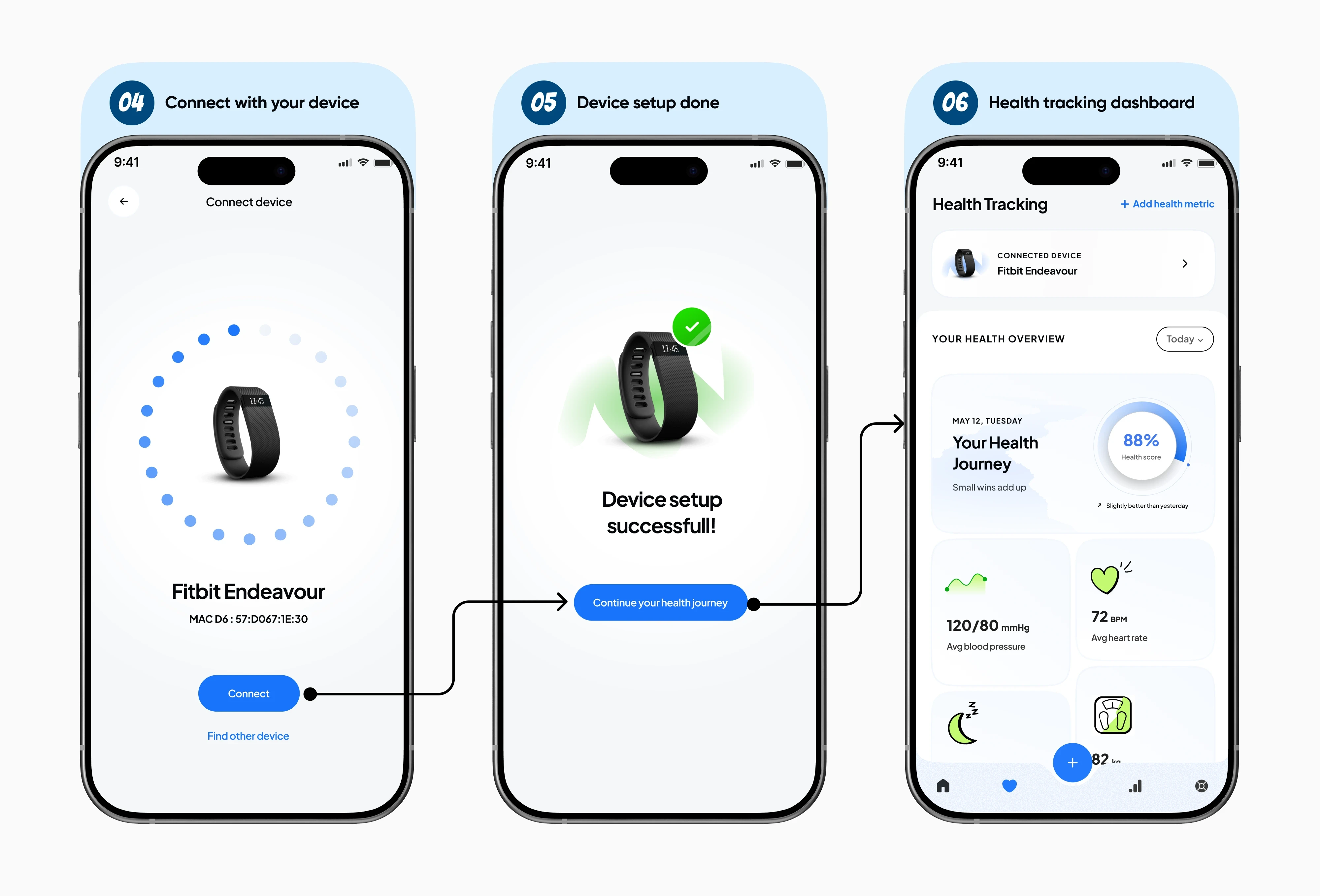
Syncing with smart devices, effortlessly
I redesigned the flow around one goal:
where users connect their wearable in under a minute and start seeing real health insights instantly. No tutorials. No jargon. Just effortless setup, clear feedback, and real-time data that makes them feel in control from day one. Now, their health journey updates itself — while they focus on living.

Why this works
When the device detects a critical issue (e.g., high BP or irregular heart rate)
❖ Zero friction = more users complete setup
❖ Live data = instant reward and trust
❖ No more manual input = habits stick longer
What this experience offers
When the device detects a critical issue (e.g., high BP or irregular heart rate)
❖ Effortless health insights
❖ Peace of mind without daily chores
❖ A setup that respects your time and builds real habits
🌟 Wrapping up
Thank you for scrolling through!
If you're still here, I guess something caught your eye maybe one thing, maybe everything ✨
Either way, I’m glad you made it. Let’s create something meaningful together.